
In an increasingly visual media world, creating the right look - the right brand - can spell success or disaster for any product. Simply put, how something looks can translate to big business or epic failure. Theater has been in this game for decades, long before clicking, trending, etc. A great piece of show art can generate ticket sales, and, importantly, merchandise sales, where happy theatergoers become walking billboards for their new favorite show.
Today, we continue our look at the key art of the shows from the 2022-2023 Broadway season. Did these logos help get ticket buyers interested? Would either entice you to run around your home town in a t-shirt bearing their logo?
2022 - 2023 Broadway Season Logos:
KPOP and Some Like it Hot
KPOP
Well, unfortunately, we already know that the key art for this musical didn't help its box office numbers at all. And of course, its failure had to do with a lot more than any image on a magnet. But what did the logo offer on its own?

I think that as purely a title logo, what they started with was the most visually appealing. There's something striking and sleek about a completely black background, and it suggests a sort of modern glamour. The high tech, industrial look of the font really mimics this tale of a 21st century music factory, and the blend of color from hot pink to purple to blue is vibrant. It also mimics the color pallet of the three central acts of the story: mWe (Pink), RTMIS (Purple) and F8 (Blue). True, I can tell all of this because I've seen the show. That said, I'd wear a t-shirt with this on it.
.jpeg)
Then, for some reason, they changed the look, putting the blend, this time only pink to purple, to the background, with the logo in white. It's not nearly as striking as the first, though perhaps they thought this might appeal more to young girls who represent their largest target audience. Personally, I don't care that much for it.
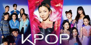
Finally, we come to the last iteration, and the one that makes the most sense. Unfortunately, this came too little too late. Here we still have the title art, in clear white over what should have been the center of the ad campaign to begin with: the KPOP acts. Cute, innocent-but-subtly-sexy boys, a glamorous diva, and sassy, smart-looking girls. This, in my opinion, would appeal to the widest variety of potential audience members, from KPOP fans to musical theater fans looking for something new and fresh.
Grade (for the full campaign): B- (If only they'd started where the ended!)
Some Like It Hot
Next up is the critically-acclaimed, though decidedly lukewarm at the box office, Some Like It Hot.
.jpeg)
.jpeg)
I find the whole thing to be visually appealing. The bright blue background, and the summery reds, oranges and yellows evoke a warmth (ok, heat) based on the title alone. The three figures capture a jazzy, big band vibe. And that art-deco-yet-modern font lets us know that the show may be set in the 30's, but it is definitely relevant today.
That's what they want us to think.
Sure, the figures show a racial profile that matches the casting. That's a good thing. And it erases the show's central conceit - men dressing as women to escape a mob hit. A good, if wholly dishonest thing - truth in advertising, blah blah blah.
But they had a real chance to highlight the great part of the story - when Jerry discovers their true self in Daphne. I mean, it's not like the producers and creative team didn't address these issues in the book and score. What are they afraid of?
One of the key themes in this updated version of an old movie is self-acceptance and living in your truth. It's a real shame the company couldn't do just that in their advertising.
Grade: C

No comments:
Post a Comment