2023 - 2024 Broadway Musical Logos:
Gutenberg! The Musical!
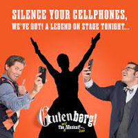
The first first thing you notice about the logo for the soon-to-close Gutenberg! The Musical! is the warm orange color. According to several sources (psychological, spiritual, etc.), orange represents energy, warmth, enthusiasm, optimism and adventure. These are attributes are all things one would want associated with a show.Now, mind you, I've not seen the show, but from everything I've read and heard about it, a musical about two guys trying to get their highly unlikely musical a producer would definitely fit the the criteria for using orange as their "show color."
The second first thing you probably notice about the show's key art is the prominence of the two stars, Josh Gad and Andrew Rannells, original co-stars of the mega hit The Book of Mormon. Not since Nathan Lane and Matthew Broderick took the stage in The Odd Couple and It's Only a Play post The Producers has a Broadway show used such a hard sell of a comedy team to get butts in the seats. They are practically begging us to see for ourselves if theatrical lightning can strike twice. Judging by the better than decent box office this one had had its entire run, I'd say it worked.
The rest of the logo is a clever nod to Broadway show advertising. We all know adding punctuation automatically makes any show title more exciting, right? Just ask Oklahoma!, Hello, Dolly! and Moulin Rouge!. Not to be outdone, this one has two exclamation marks. Then there's their multiple taglines. "Two men. One Dream. No chance." It's the patented Neil Simon 1-2-3 joke, really. The first two parts set us up as if this is serious art. The third is the unexpected (and humorous) twist that is supposed to reel us into the box office. Then there's the "twist" on the typical "The Musical" where they have "handwritten" in some supplemental hype. It is kinda smart.
Wisely, they've made a joke about the subject of The Musical! (which isn't what the show is about, really) by using two stylized fonts. "Guten" is old school German looking (just like the printing press Bible guy was), followed by the broken, off kilter "berg!" that somehow evokes an iceberg of the type that sinks ships.
As if a well thought-out and presented logo wasn't enough, they really upped the ante with the other big selling point of the show - a cameo by someone famous at the end of each performance. Word spread over social media like a wildfire every night bout who it was. So they were smart and got out ahead of it by appealing to theater fans with Broadway themed ads hinting at who was the next cameo. Kudos for that!
Clearly, the combination of logo and prominently featured co-stars worked. The limited run show is a hit. Good for them!
Grade: A+


.jpeg)
.jpeg)
.jpeg)

No comments:
Post a Comment