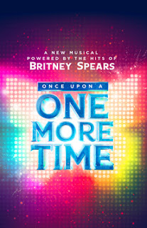
Here we are just a week after the Tony Awards, and we already have a new logo to dive into! Opening later this week, the Britney Spears musical is yet another catalog jukeboxer that presents a fractured fairy tale scenario of female empowerment. How successful a venture this is as a show, we will discuss later; today, we will discuss just how successful their advertising is.
2023-2024 Broadway Musical Logos:
Once Upon a One More Time
Once Upon a One More Time
Google "Britney Spears Butterfly" if you aren't a hardcore fan, and it will enlighten you (maybe) as to why the species figures so prominently in the show's logo. And given that it looks like it is made out of lights, one might think that this is some sort of concert. This is by design I'm sure, however ethically murky that might be. Do butterflies figure into the show at all, or are they just a Brit signal?
Now add words. The font, right off Microsoft Word, is vaguely fairy tale-ish - royal, if you will - and in shiny Cinderella blue. Kudos to the marketing design team for making a clever tagline, ending with Ms. Spears' name in bright white and second only to most of the title in size. The biggest part of the title, "One More Time," references her biggest hit, of course. The part of the otherwise moderately clever title, is, let's be honest, nearly invisible. Again, I have to ask, is this a call to Britney fans, and not musical fans (there are a lot of overlaps between those two groups)? Is this a Brit and Switch here?
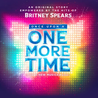
Another iteration of the logo has a much more appropriate, show themed tagline, changing "powered by" with "empowered by." The latter is also a much more trendy buzz word. On the other hand, maybe it's a little too smart. (Who is their target audience?) At least it recognizes that it is actually a musical and not a concert. This one is the better of the two so far.
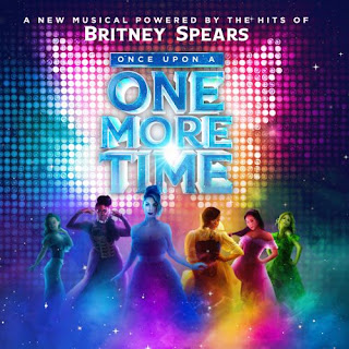
Again, kudos to their team for trying to evolve their logo. Perhaps after a few surveys of the public, they realized they needed to add something to get potential ticket buyers to see what the show is really about. Adding the princesses to the logo is probably a good idea. And I like the blend of Disney Princess posing with 21st century girl power poses. Definitely adds to advertising the show not just Spears. And the rainbow... Happy Pride!


And yet, something about feels a little too... familiar... copycat-ish. Famous females as rock stars. I mean, six queens should set the standard for six princesses...
I hope the show is better, fresher, than this logo.
Grade: D


No comments:
Post a Comment