
Hello again, Logo Lovers! Today, let's talk a little bit about the show art for two of this season's biggest, splashiest musicals. One, I love (maybe my favorite of the year), the other, I really dislike (definitely my least favorite of the year). What do you think? Will they help or hurt their ad campaigns? Are they good enough to get you to buy a ticket? Would you buy merchandise with these logos on them?
2022 - 2023 Show Logos:
Bad Cinderella & New York, New York
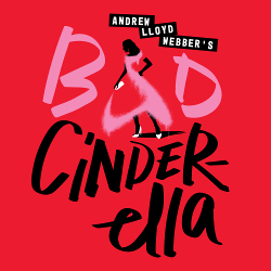
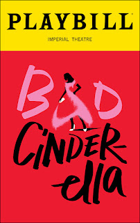

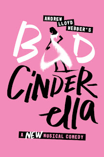
Bad Cinderella:
So, I like the minimalism of the key art. It really makes you focus on the subject. And the red background is eye-catching. The black writing (with some white highlights) also stands out and makes it really easy to read. All of those are great things. What's the problem then?
It is very unattractive. And it looks lazy - like the ad team had five minutes to come up with something, and used only three. While I understand that it's trying to show graffiti, and that even ties into a plot point in the show, it isn't very good graffiti. Maybe more urban art style would have been more exciting. The spray paint dress/"a" is a weak attempt, since it barely looks like a gown, and barely looks like an "a." Finally, trying the logo with pink instead of red certainly turns down the volume on the "badness." Dare I say it? Are they pandering to that tired pink-is-for-girls stereotype?
I suspect - no, hope - that if the show runs for awhile, that they go the "photo from the show/real life people" route.
Grade: F

.jpeg)
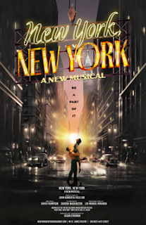
New York, New York:
Where do I start? I love everything about this! The dark and light contrast. The nostalgic use of iconic New York City things - a busy street, filled with period cars, skyscrapers and brownstones, the Chrysler Building gleaming. And the central image of the couple in a romantic/dance-y embrace in the middle of the street suggests Broadway musical style happiness. Is it a chance meeting? Are they reuniting? Is he lifting her up for a closer look at the new neon sign being lifted up to the skies. No matter, there's a story there!
And about that neon sign - wow! What a wonderful symbol of the city - old school and beautiful, in bright yellow and gold - emblematic of a bygone era of growth and modernization. I love how a crane is swinging it into place. There is a lot of movement in this key art. The hustle and bustle of old New York. As the song and tagline says, I want to be a part of it.
Grade: A+

No comments:
Post a Comment