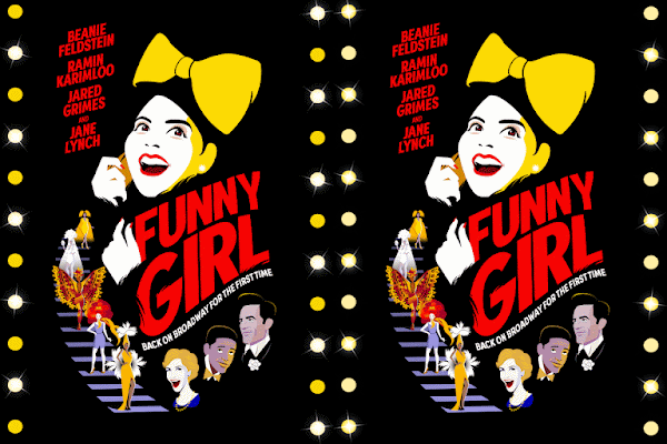
I'm old enough to remember when Microsoft Word Art was new and all the rage. Who knew it was making a comeback in the world of Broadway show art and advertising?
Logo Review: Funny Girl (2022 Revival)
Having seen the current revival of Funny Girl, I won't spoil the show for those who have yet to see it (review will post when appropriate), but I can verify that the images that appear on the poster and various other bits of merch do, in fact, resemble what is seen on the stage at the August Wilson Theatre these days. How good they are may depend on your threshold for pictures that range from accurate to insulting.
 |
| This should be on the poster |
Even accounting for the stylized faces, one has to wonder who thought these were a good idea. At least all of the skin tones are equally frightening - Jane looks like Caspar the Friendly Ghost and the Joker joined forces; the less said about Ramin, the better. And Jared looks, um, subservient - hunched over and grimly grinning.
Beanie is the star of the show, and certainly deserves to be prominently featured on any and all advertising. Did she get any kind of approval rights? I'll leave it at that. But I do have a couple of questions. One, what with that hideously large yellow bow? She doesn't wear one in the show (at least not as of the early preview I attended). Two, why is she on a cell phone? Fanny Brice was multi-talented, but I think we'd have heard if she was a time traveler. (Spoiler alert: the show is pretty much in period.)
The very best part of the key art is the Ziegfeld-style staircase with the variety of Follies girls on them. Each one represents a different number, and the images hint at the beauty of the costumes. Would that the stars of the show got similar treatment here. I'm just throwing it out there, but why not have a tuxedo-clad Nicky Arnstein, or a tap dancing Eddie for example? And why not do a stylized Beanie as Fanny in a costume she actually wears? They could vaguely resemble the actors, and save a lot in new key art when the stars leave the show (if it runs long enough). True, it seems they have already saved a good chunk of change by using the aforementioned Word Art for all of the text.
Grade: C-


No comments:
Post a Comment