Hello, again, logo lovers! Today, we are taking a closer look at the key art for two of this season's biggest - literally and figuratively - musical revivals, Camelot and Sweeney Todd. One, I think is very successful in conveying the show it represents. The other, not so much.
Camelot:
If you've followed me for any serious length of time, you know how much I admire the works of James McMullen. He is one of my favorite show art artists of all time, in fact. So you can imagine how much it pains me to say that I find this logo to be a complete miss.
Where do I start? How about that title? The "font" is generic, the shade of yellow, while eye-catching, is practically offensive. The color palette is bleak - muted earth tones and smokey grey sky, punctuated with a fire red. The images - a tree in the foreground that calls to mind the African Savannah, not Medieval England, and the mountaintop castle is stark and lonely looking. The color combination and the bleak imagery makes for a dystopian nightmare, not a fantastical Knights of the Round Table, Lancelot-Arthur-Guinevere romp. Where is the pageantry? The magic? The "take me away to another time"?
The bottom line here is that I find it, well, ugly. Nothing about it entices me to look into it more, let alone buy a ticket. (Of course, I have a ticket...) I hope the show is better than the logo.
Grade: F
Sweeney Todd:
Funny how a bleak color palette and stark imagery that does not work for one show, works brilliantly for another.
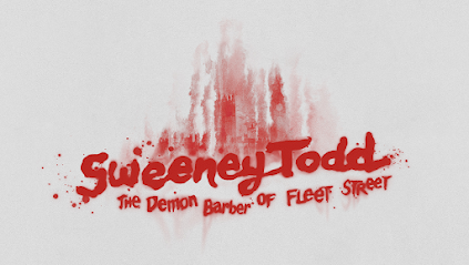
Much has been made of the fact that this revival will be a big production: big cast, big orchestra, even a big theater. The epic nature of this version is more like the iconic 1979 original than any other New York revival of the Sondheim classic. It makes perfect sense, then, that they are using the original title plate. It is what they have done with it that makes it chilling fun. Here the blood stain of the title is smeared as if it were spatter sliding down a wall, or what a body might do as it slides down a chute to a basement... Even better, within that smear is a Victorian London skyline surrounded by a bloody smoke.. a city on fire, if you will.
I also love the Playbill/advertising image, a painting of our two stars in character on a cobblestoned London side street, faces menacingly aglow from a sewer grate, bowels of the underground clearly aflame. If I had to quibble about anything, it's that the title doesn't stand out enough in this iteration.
This fresh take on a classic has me very excited to pay a visit to Sweeney and Mrs. Lovett very soon. I think the logo adds to the thrill.
Grade: A+
.jpeg)


No comments:
Post a Comment