We're still playing catch up on the Broadway logos for the 2022 - 2023 season. So today we'll take a look at a pair of shows from the fall. One has closed, the other seems to be gaining traction. Did their logos play a part?
2022 - 2023 Show Logos:
Almost Famous and Kimberly Akimbo
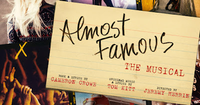
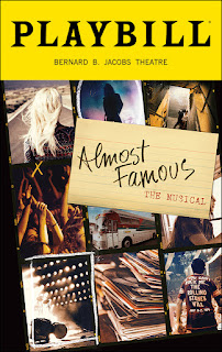
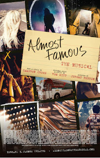
Lamentably, Almost Famous has closed, but I don't think it had anything to do with its show art. Perhaps it was the mixed-to-negative reviews. Or maybe it unsuccessfully walked that fine line between "show based on a flop film" and "show based on beloved niche film." There was certainly a fair amount of word-of-mouth and fan support growing, but I guess there wasn't enough gas in the tour bus to make it to a fill-up.
As far as the logo goes, it fits the show perfectly. The "handwritten" title on an otherwise typed index card offers a sort of time stamp - the main character is taking notes and typing them out in a bygone era - no device at work here. Then there's the excellent collage of photos - prints from an old Instamatic or Polaroid that capture key images from his cross-country, rock 'n roll journey. Piles of record albums, t-shirts, concert lights, a young groupie, the tour bus, and an idol in silhouette against stage fog all tell the story of the show. The faint sepia tone and fading say "memory play."
Having seen the show, I love the artwork. It evokes some very fond memories. But I have to wonder, does it require too much time to soak in as one walks by the theater to even consider buying a ticket? We will never know.
Grade: A-

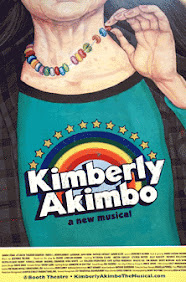
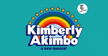
First of all, while the image perfectly captures the main character - a flannel shirt over a t-shirt and candy necklace fairly screams 80's-90's teenage girl, while the wrinkled neck and hand says aging old woman. And the title image, done in the 80's-90's style of the Great Adventure theme park, certainly evokes time period and a smart sense of whimsy. Having seen the show, I now instantly "get it."
But there in lies the dilemma. Does this key art too heavily depend on knowing the show before you see it to work? Will people stop long enough to even take it all in? How many people will wonder if this is a new bio-musical about someone they've never heard of before?
I have no idea how this might pan out for the future. Tourists who see the NYT Critic's choice label might give it a go, and certainly the heaps of awards it'll receive will help. For now, though, I'm thankful that word of mouth and a great social media campaign seem to be getting people into this wonderful show.
Grade: C+
No comments:
Post a Comment