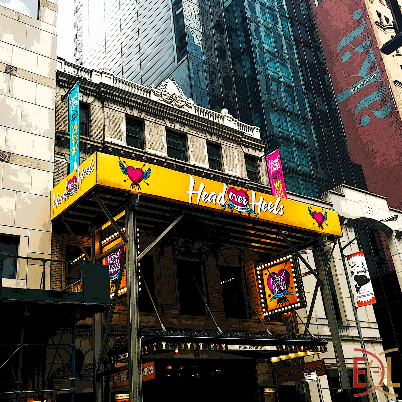
These colors fairly scream "WE LOVE THE 80's!!" Fitting for an 80's icon band like the Go-Go's, and, I presume a good portion of the target audience - Gen Xers looking at their favorite decade disappear farther away in the rear-view mirror. And they - we (I am one!) - have great memories of Belinda and the girls, and money to burn to relive any part of it. So, yes, the colors alone could act like a beacon for us! (Tip: Add neon!)
While the title font is totally 80's, the tag line font (and ribbon for that matter) is all about being Elizabethan! Add to that ye olde etched look of the heart, and you can tell just by looking at it that there is a time-warp mash up going on here. I believe that is, in fact, what is going on in the show it represents - another mark of a good show logo.
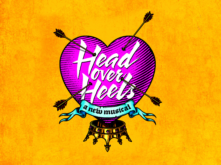
Of course, the whole image reminds me of a tattoo a hair band groupie might have gotten during the Reagan years...
Put it all together and it hits the big things that I think makes a good show logo:
- it's eye-catching enough to be noticed in the midst of all of the visual cacophony
- it represents the feeling of the show (in this case love and fun)
- it represents what the show is all about, giving away enough to pique the curiosity, but not too much to give it all away
We'll see if the show is as good as its logo. Why not be optimistic?
Grade: A

No comments:
Post a Comment